In this blog post I will explain how to customize the app colors for model-driven apps with the new look enabled It covers:
- The steps to create an XML file with color selections for the app header background, foreground, and button states.
- The steps to publish the XML file as a web resource and add an override setting to the app settings.
- The publishing and validation steps to enable the app header styling for all apps with the modern look.
- The contrast ratio requirements for the app header visuals to ensure accessibility.
Modify the app header colors with XML Web Resource
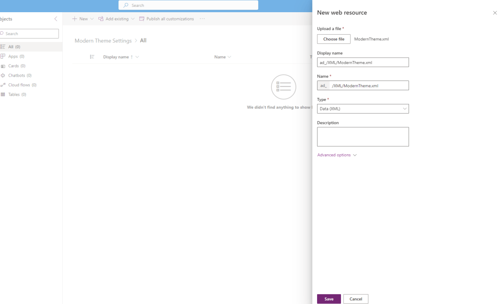
Initiating the customization of app header styling begins with the creation of an XML file containing designated color preferences. Subsequently, the process involves generating an XML web resource, incorporating attributes specified within an AppHeaderColors tag. To generate the web resource for your customized app header styling, follow these steps:
- Open a text or XML editor and save the XML file designed for the web resource.
- Background: Sets the app header’s background color; essential for any changes to take effect.
- Foreground: Determines the text color of the app header. If unspecified, the system calculates a suitable contrast to the background color.
- BackgroundHover: Specifies the background color of hovered-over app header buttons, with the system calculating a color based on the background if not provided.
- ForegroundHover: Defines the text color of buttons during hover, with the system attempting a contrast calculation if unspecified.
- BackgroundPressed: Sets the background color of pressed buttons, following the same defaulting logic as backgroundHover.
- ForegroundPressed: Specifies the text color of pressed buttons, mirroring the defaulting logic of foregroundHover.
- BackgroundSelected: Determines the background color of selected buttons, aligning with the defaulting logic of backgroundHover.
- ForegroundSelected: Sets the text color of selected buttons, with defaulting logic mirroring backgroundHover.
<AppHeaderColors
  background="#0075CF"
  foreground="#FFFFFF"
  backgroundHover="#165A31"
  foregroundHover="#FFFFFF"
  backgroundPressed="#0F1C12"
  foregroundPressed="#FFFFFF"
  backgroundSelected="#153D23"
  foregroundSelected="#FFFFFF"
/>
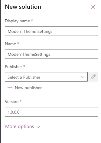
2. Create a solution and create a new Web Resource.
3. To apply your customized app header colors across all apps in your environment with the “New look,” follow these steps:
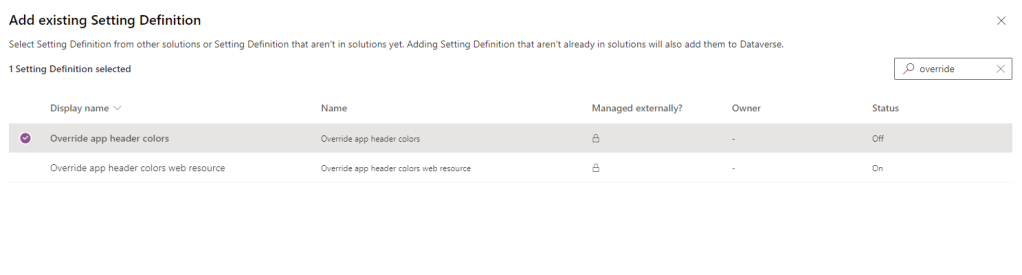
- In the solution containing your web resource, go to “Add existing” > “More” > “Setting.”

- In the Search box, type “Override,” select “Override app header color,” then click “Next,” and finally, choose “Add.”
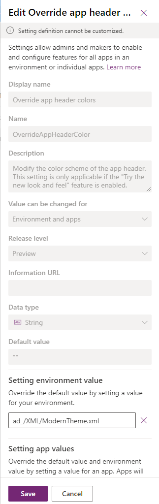
- Within the solution, select “Override app header color,” and click “Edit” on the command bar.
- In the Edit Override app header color properties pane on the right, opt for “Setting environment value” and input the unique name of your previously created web resource.
- Save your settings.
Click “Publish all customizations” on the command bar (visible when no components are selected).
Upon refreshing or running the app, the app header should reflect the specified colors, as demonstrated with the example colors provided.
Before applying the settings:

After applying the settings:

 Crm Minds
Leave a comment