Today I want to talk about using Python with Dataverse. Most Dynamics 365 developers work with C# for plugins, Power Automate for flows, and TypeScript for PCF controls. That covers a lot of ground.
But the world around us is changing fast. Gen AI is not just a trend. It is reshaping what is possible in business applications. AI agents, machine learning scoring, semantic search, intelligent automation: all of this is being built in Python. The libraries, the frameworks, the talent, the tooling are all there. If your Dataverse data cannot talk to that ecosystem, you are leaving value on the table.
Python is now the language of AI. Connecting it to Dataverse opens up scenarios that were not realistic before: feeding CRM data into a model, building intelligent automations, or producing management-ready visualisations directly from live data.
In this post I will show you a complete real-world example I built using the PowerPlatform-DataverseClient-Python SDK. The example is a C-level pipeline dashboard: a Python script that queries live opportunity data from Dataverse, builds a four-panel executive chart, and posts an in-app notification inside the model-driven app, all in one run.
The Scenario
Sales directors and C-suite want pipeline visibility. Dynamics 365 has built-in dashboards and charts, and for most cases they are enough.
But sometimes you want something more specific. A custom layout your CFO can read at a glance. A PNG you can drop into a slide deck or attach to a weekly report. A script you can schedule, so the chart and the notification are always ready on Monday morning without anyone clicking anything.
This is exactly the kind of task Python handles well. You write the logic once, you run it whenever you need it, and the output goes wherever you want it.
What Makes This Approach Different
The key design decision in this script is where the work happens.
A naive approach would be to fetch all opportunities from Dataverse and then aggregate them in Python. For a small environment that is fine. For a production environment with thousands of records, you are pulling a lot of data over the network and doing in Python what the database could do for you.
This script does it differently. It uses a FetchXML aggregate query to run the GROUP BY and SUM on the Dataverse server. Only the aggregated rows come back over the network, one row per account. The query handles:
- Grouping by account
- Summing the estimated value across all non-lost opportunities
- Counting the number of linked opportunities
The aggregated result goes straight into pandas for filtering and sorting. Then matplotlib builds the four-panel chart. Finally the script posts a Dataverse in-app notification that shows the top accounts in the model-driven app bell.
Connecting Python to Dataverse
The SDK uses azure-identity for authentication. For local development you set up a ClientSecretCredential using an app registration. Credentials come from a .env file so nothing is hardcoded.
from azure.identity import ClientSecretCredentialfrom PowerPlatform.Dataverse.client import DataverseClientcredential = ClientSecretCredential( tenant_id=tenant_id, client_id=client_id, client_secret=client_secret,)with DataverseClient(dataverse_url, credential) as client: # client is ready to use here pass
The with block opens and closes the underlying HTTP connection pool cleanly. The client object gives you access to records, queries, table metadata, relationships, and file uploads.
What the SDK Gives You
CRUD Operations
# Create a record and get back its GUIDaccount_id = client.records.create("account", { "name": "Contoso Ltd", "revenue": 5_000_000.0,})# Read it backaccount = client.records.get("account", account_id, select=["name", "revenue"])print(account["name"]) # "Contoso Ltd"# Update a fieldclient.records.update("account", account_id, {"revenue": 6_000_000.0})# Delete the recordclient.records.delete("account", account_id)
SQL-Style Queries
For read operations you can write a SELECT statement instead of building OData filter strings by hand. The SDK converts it to the correct $filter, $select, and $orderby parameters and handles paging automatically.
results = client.query.sql( "SELECT name, revenue " "FROM account " "WHERE statecode = 0 " "ORDER BY revenue DESC")for row in results: print(row["name"], row["revenue"])
These are the building blocks. Now let me walk through the dashboard script itself.
The Dashboard Script
The full script is at examples/advanced/c_level_dashboard.py in the repository. It runs in three steps.
Step 1: Fetch and Aggregate with FetchXML
The dashboard uses a FetchXML aggregate query. This is not exposed as a method on the SDK client, so it falls back to a raw HTTP call using the bearer token from the client.
fetch_xml = ( '<fetch aggregate="true">' '<entity name="account">' '<attribute name="accountid" groupby="true" alias="account_id" />' '<attribute name="name" groupby="true" alias="account_name" />' '<link-entity name="opportunity" from="parentaccountid" to="accountid"' ' link-type="inner" alias="O">' '<attribute name="estimatedvalue" aggregate="sum" alias="total_amount" />' '<attribute name="opportunityid" aggregate="countcolumn" alias="order_count" />' '<filter>' '<condition attribute="statecode" operator="ne" value="2" />' '</filter>' '</link-entity>' '</entity>' '</fetch>')
The link-type="inner" means only accounts with at least one opportunity come back. The filter on statecode excludes lost opportunities before the SUM runs, which is the correct place to apply it.
The result is a DataFrame with one row per account: account_id, account_name, total_amount, and order_count. The calling code then filters to accounts above the minimum threshold (default 1 000 GBP) and sorts by total amount descending.
Step 2: Build the Four-Panel Chart
The create_dashboard method takes the DataFrame and builds a chart with four panels using matplotlib’s GridSpec layout.
- Top left: Horizontal bar chart showing the top N accounts by pipeline value.
- Top right: Pie chart showing revenue share among the top N.
- Bottom left: Scatter plot with number of opportunities on the x axis and total pipeline value on the y axis. Good for spotting accounts with many small deals vs. a few large ones.
- Bottom right: Donut chart comparing the top 5 accounts against the rest of the portfolio. The total pipeline value sits in the centre of the donut.
The chart is saved as c_level_dashboard.png. Here is what the output looks like:
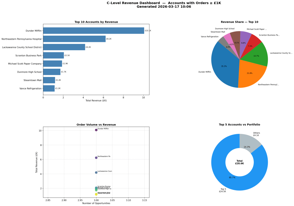
The save call uses dpi=150 and bbox_inches="tight" so the PNG is clean and sharp enough for a slide deck.
Step 3: Send the In-App Notification
After saving the chart, the script calls send_top_accounts_notification. This function posts a Dataverse in-app notification that appears in the bell icon inside any model-driven app.
send_top_accounts_notification(client, df, recipient_email=recipient)
The function builds the notification body by formatting the top five accounts as a ranked list with their pipeline value and opportunity count. Then it POSTs to the SendAppNotification unbound action.
If you pass a recipient_email, it looks up that system user by their internalemailaddress and sends the notification to them. If you leave it blank, it calls WhoAmI() and sends it to the currently authenticated user.
The result is a notification in the model-driven app with the top accounts summary, without sending an email or opening Teams.
Running the Script
Set your credentials in a .env file at the root of the repo:
AZURE_TENANT_ID=your-tenant-idAZURE_CLIENT_ID=your-client-idAZURE_CLIENT_SECRET=your-client-secretDATAVERSE_URL=https://yourorg.crm4.dynamics.com
Then install the optional dependencies and run:
pip install pandas matplotlibpython examples/advanced/c_level_dashboard.py
The script prints a preview of the top 10 accounts in the terminal, saves the PNG, prompts for an optional recipient email, and sends the notification.
The Code
The full example is in the PowerPlatform-DataverseClient-Python repository. I forked it from the original Microsoft repo and extended it with the dashboard example and the other scripts mentioned in this post. The extension module lives at src/PowerPlatform/Dataverse/extensions/sales_dashboard.py and is a clean way to see how to build on top of the SDK without modifying the core.
When to Use Python and When Not To
Python is a good fit for:
- Analytics and reporting. Pulling Dataverse data into pandas, running aggregations, building charts that go beyond what standard dashboards can do.
- Scheduled jobs and exports. Generating a PNG every Monday morning, syncing records to a flat file, or running batch data quality checks.
- Machine learning and AI. Scoring opportunities with a trained model, calling an LLM with Dataverse data as context, writing scores back to custom fields.
- Developer tooling. Seeding dev environments, running test fixtures in a pipeline, generating health-check reports.
- Azure Function backends for Copilot Studio. Lightweight HTTP endpoints that serve Copilot Studio topics with live Dataverse data or Python-computed results.
There are also cases where Python is not the right choice:
- Real-time server-side logic. If you need to enforce a business rule when a record is created or updated, you need a C# plugin on the Dataverse event pipeline. There is no Python equivalent for that.
- Citizen developer workflows. If a business user needs to own and maintain a flow, keep it in Power Automate.
- Model-driven app UI logic. Form scripts and command bar customisations should stay in JavaScript or TypeScript.
Closing Thoughts
Python is now a practical tool for Dynamics 365 work. The SDK removes the raw HTTP boilerplate, and with pandas and matplotlib on top you can go from a FetchXML query to a presentation-ready chart in under a hundred lines of code.
If you are curious about the full implementation, the code is all in the PowerPlatform-DataverseClient-Python repository.
Let me know if you have any questions in the comments below.
See you next time!

Leave a comment